Goods Movement
THE HEART OF THE E-GROCERY
ROLE
UX Designer
TOOLS
Figma
MIRO
DURATION
2022-Present
✦ PROBLEMS & CONTEXT
At the time, Segari didn't have the proper tools to record goods movement. Even though the IT databases were already built and can be accessed through a computer, most of the field work was still done manually using paper and it led to inefficiency and data inaccuracy. Missing goods was another suspect for data inacuraccy. The company needed ways to keep accountability in check. These low hanging fruit problems eventually led to the idea of creating the goods movement app for mobile -- reason being for its mobility and how it fits most of the field work context [compared to a PC/desktop app].
LOADING CONTENT...
IMAGE
Warehouse Context - 2022
✦ CHALLENGES & IDEATION
Since the main idea was pretty much a low hanging fruit, I took the opportunity to reframe the problem a bit -- how can we make the adaptation from manual to app workflow go smoothly and at the same time find things to improve beyond the digital context. Like finding ideas to cultivate a disciplined environment & behaviour for the workers to even further boost workflow.
On paper, the then-existing flow was straight forward: choose the location of the goods, grab the goods, and move the goods to the new intended location. The type of goods can vary, from fruits, veggies, dry goods, etc.
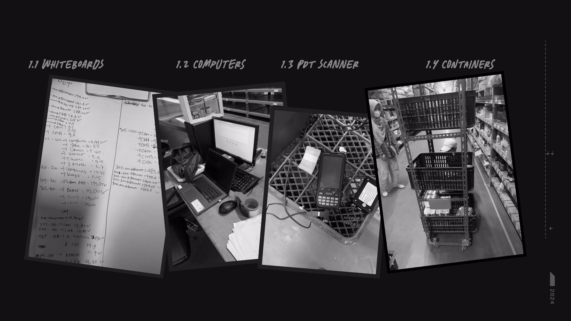
But a lot of the unseen problems were unfolding when I observed the workflow live -- which was also the initiative to gather user insights. Besides the labor work [ie pick up goods, move/push the goods], the administrative workflow was done manually [ie printing, writing changes on papers, putting the papers down, take the papers back, take notes, etc]. When combined, these workflow caused a lot of inefficiencies and human errors. Although there were devices scattered around, they were yet to be fully utilized properly.
LOADING CONTENT...
IMAGE
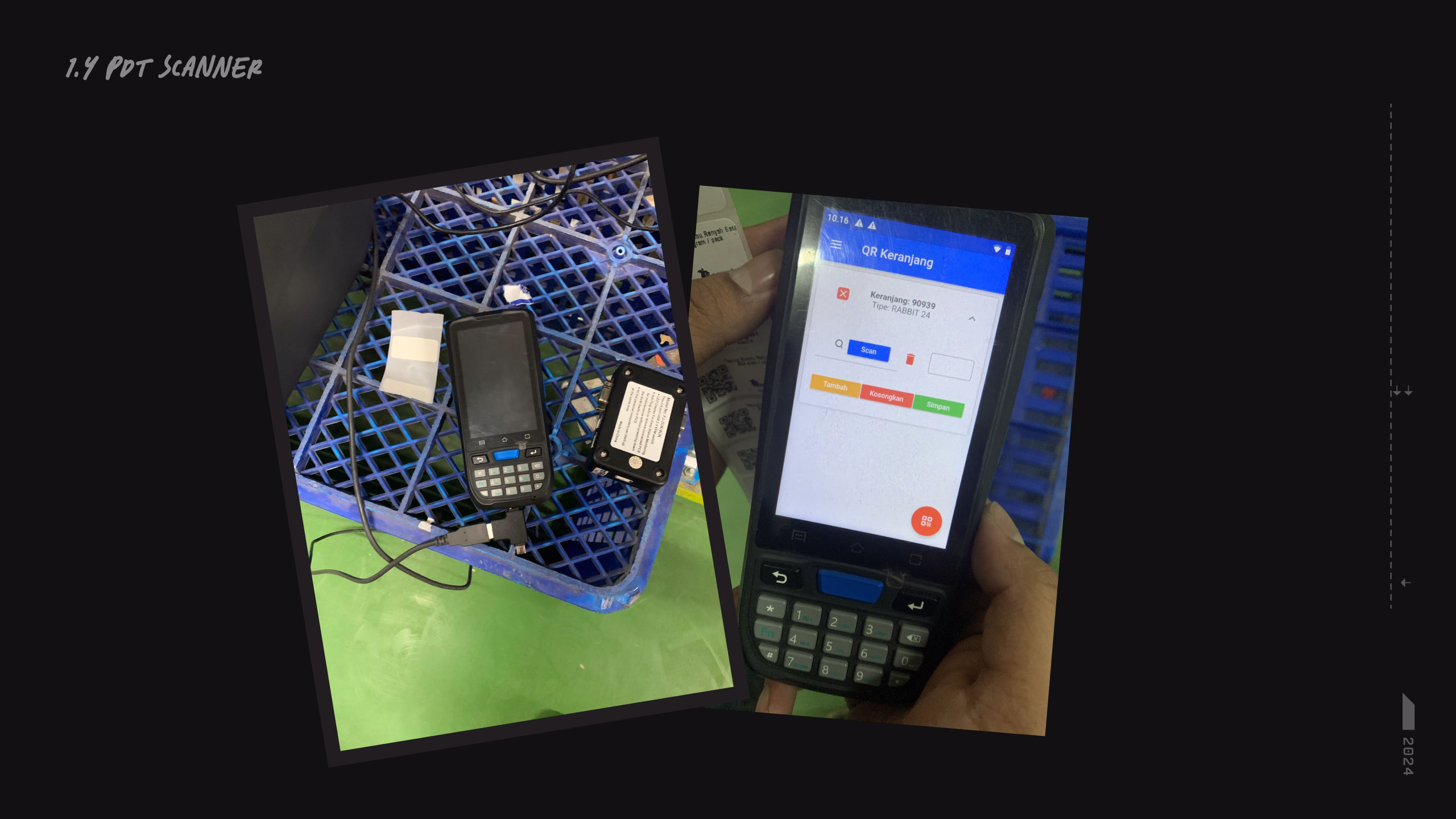
PDT Scanner pre-designer days
LOADING CONTENT...
IMAGE
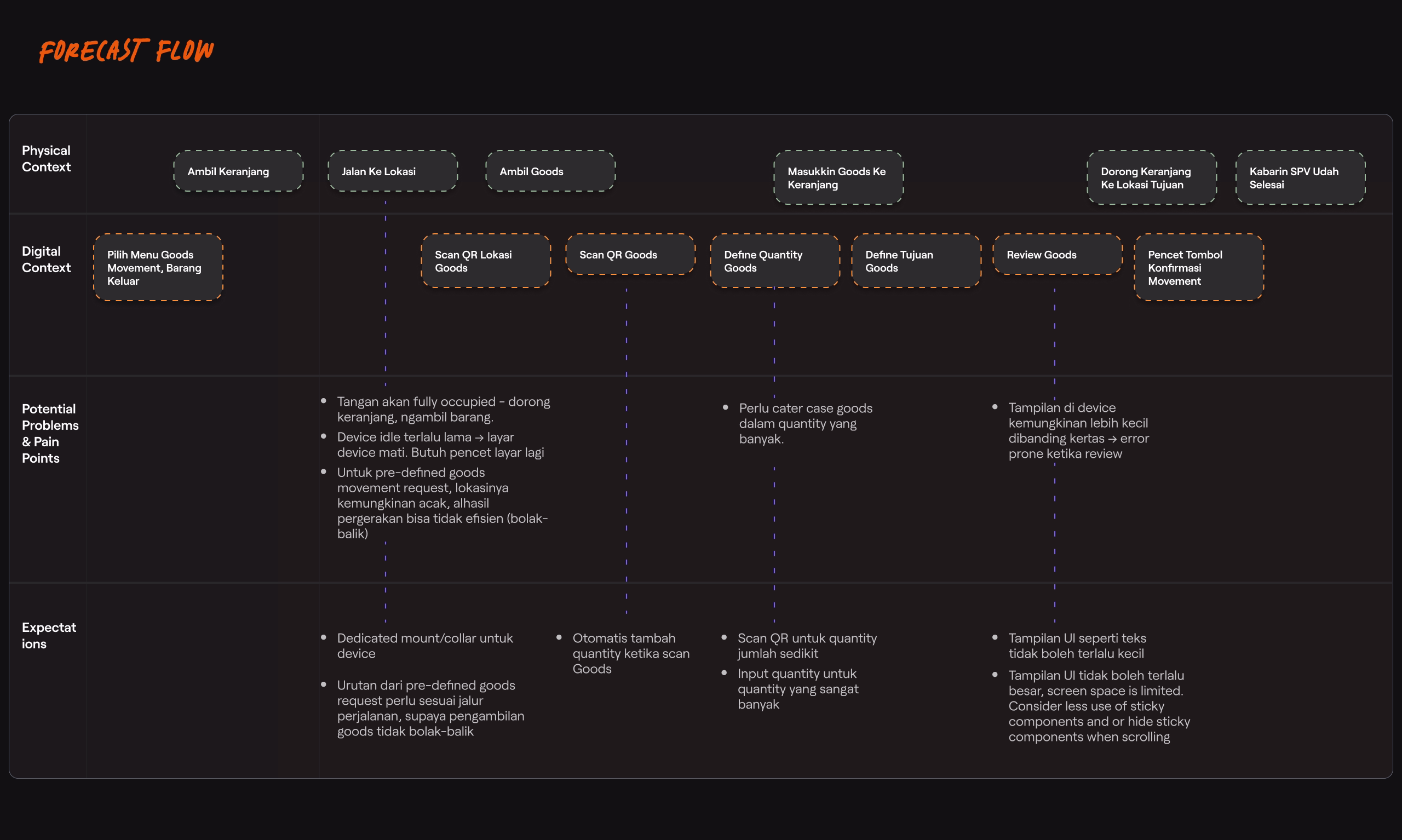
FORECAST FLOW MAPPING [Click to Zoom]
To better devise a solution, I made a “forecast" to help visualize the implication of the solution. It divided the main action to 2 parts, the physical and digital domain, alongside its potential pain points and opportunities. This is to make sure:
- The stakeholders are synced, aware, and aligned of what the challenges would be
- The workflow transition/adaptation goes smoothly
- Find ways to improve the workflow outside the digital context. Example was that I suggested to positioned the desks racks to support an efficient workflow.
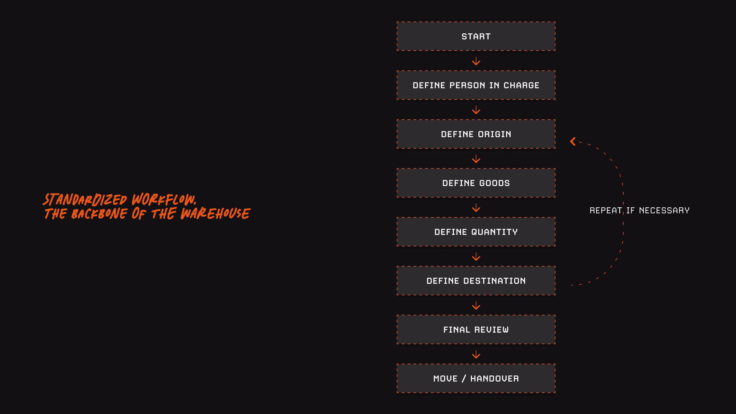
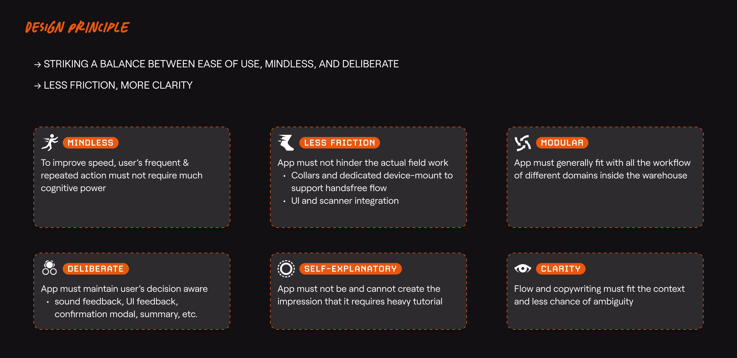
✦ DESIGN PRINCIPLE
To create a strong general discipline and provide clear direction for the rest of the stakeholders, we discussed and agreed upon a general standardized flow, then I broke down the design principles.
LOADING CONTENT...
IMAGE
BACKBONE OF Goods Movement - Credits to Fitri
LOADING CONTENT...
IMAGE
Design Principle - The breakdown helps keep the stakeholders principle in check.
LOADING CONTENT...
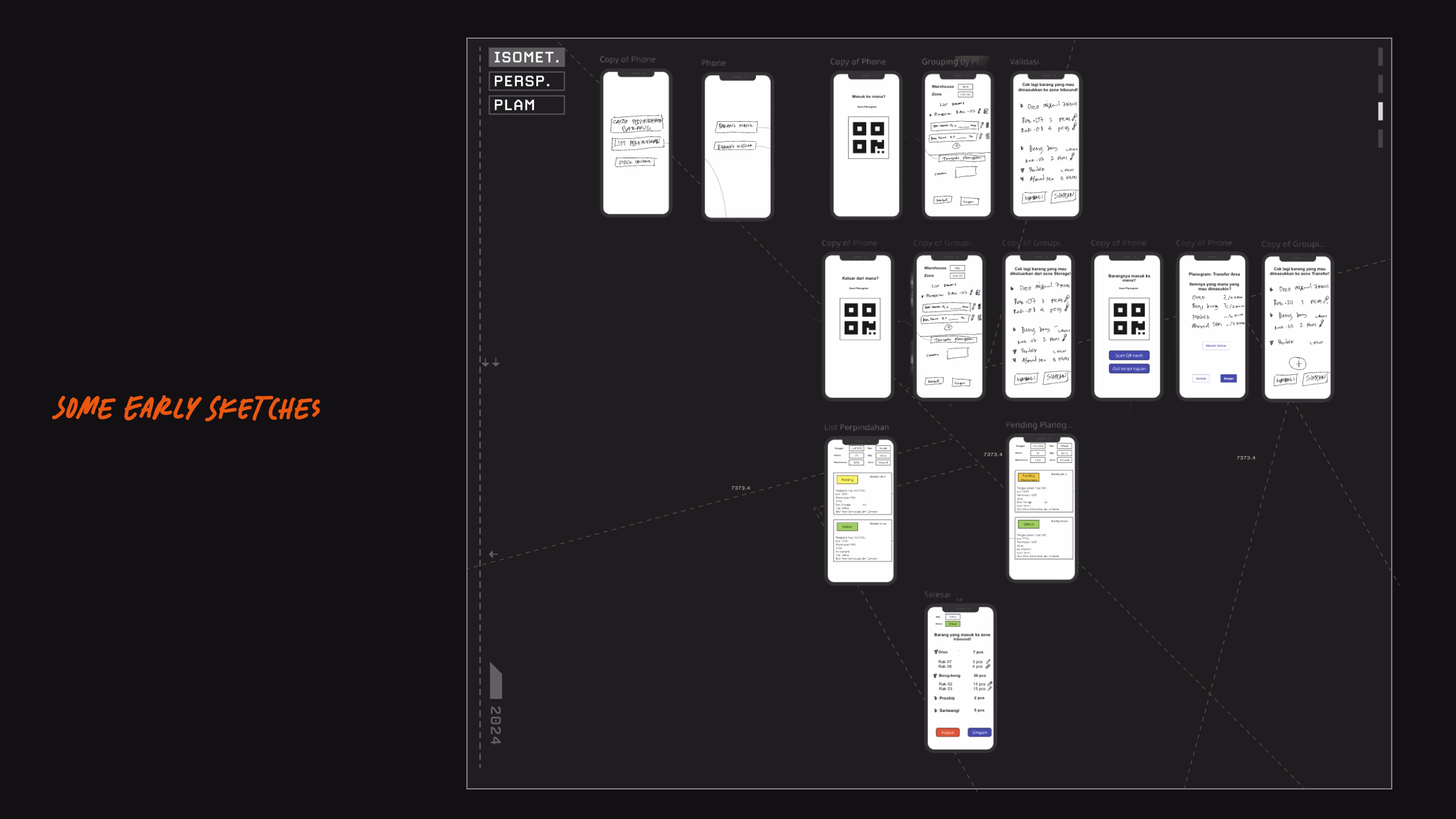
IMAGE
Early Sketches
✦ COLLABORATION & EXECUTION [DESIGN x DEVS x PMs]
To prepare for smoother development process, I laid out the basic design systems, nothing fancy, things like:
• What font to use -- ie Roboto, because its standard for Android, has a good legibility, and its native.
• Colors -- Mainly used green to help with good contrast
• Button shapes etc.
The showcase below is essentially the core feature of the app and should help on representing my thought process and design consideration. [Due to NDA, I am unable to showcase the whole flow]
Loading Content...
VIDEO
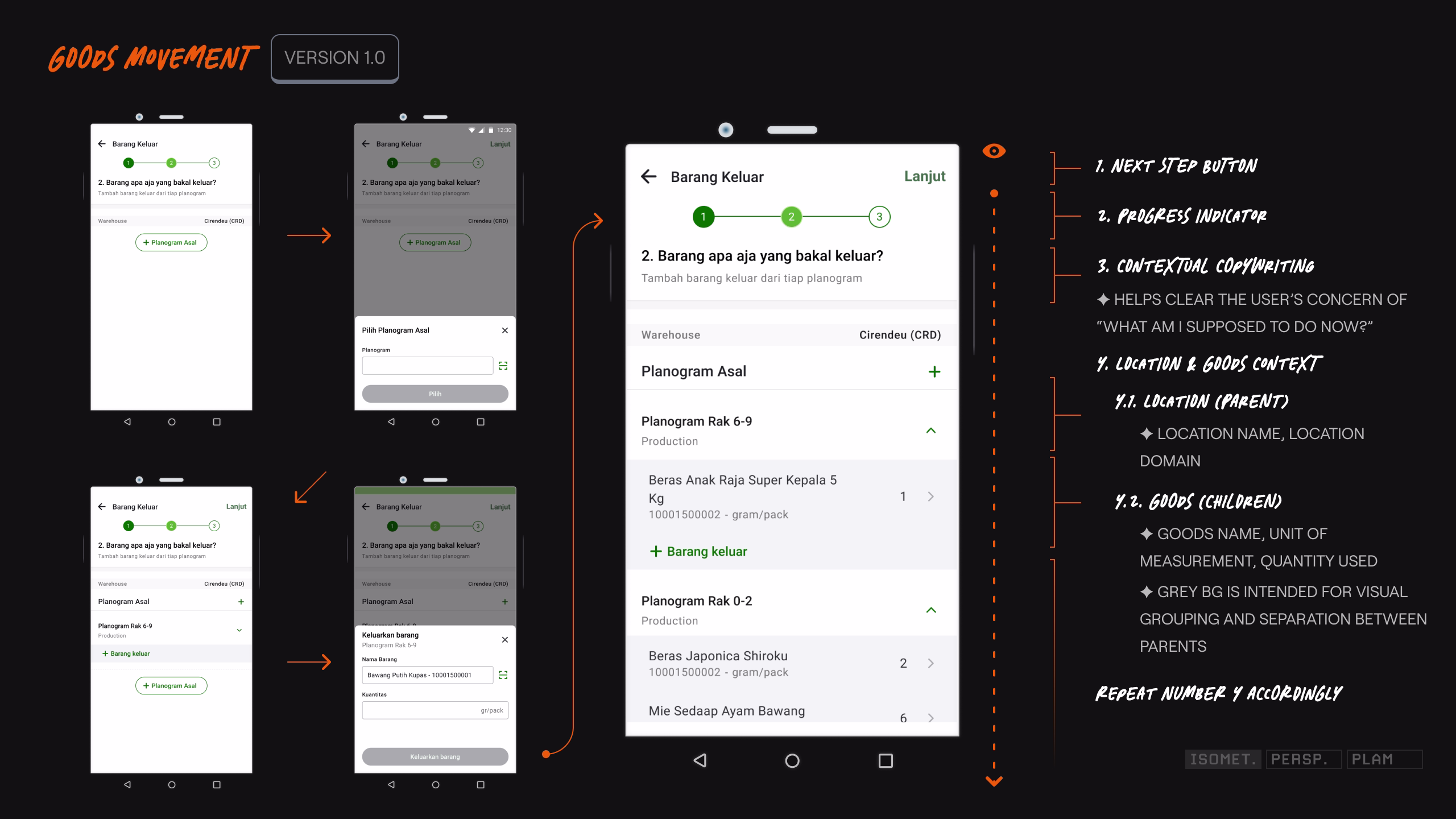
MOVING OUT AN ITEM
LOADING CONTENT...
IMAGE
Part of the Goods Movement UI Flow
LOADING CONTENT...
IMAGE
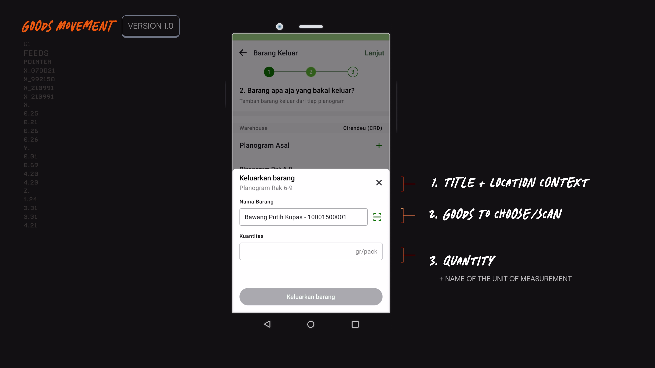
UI showcasing subflow
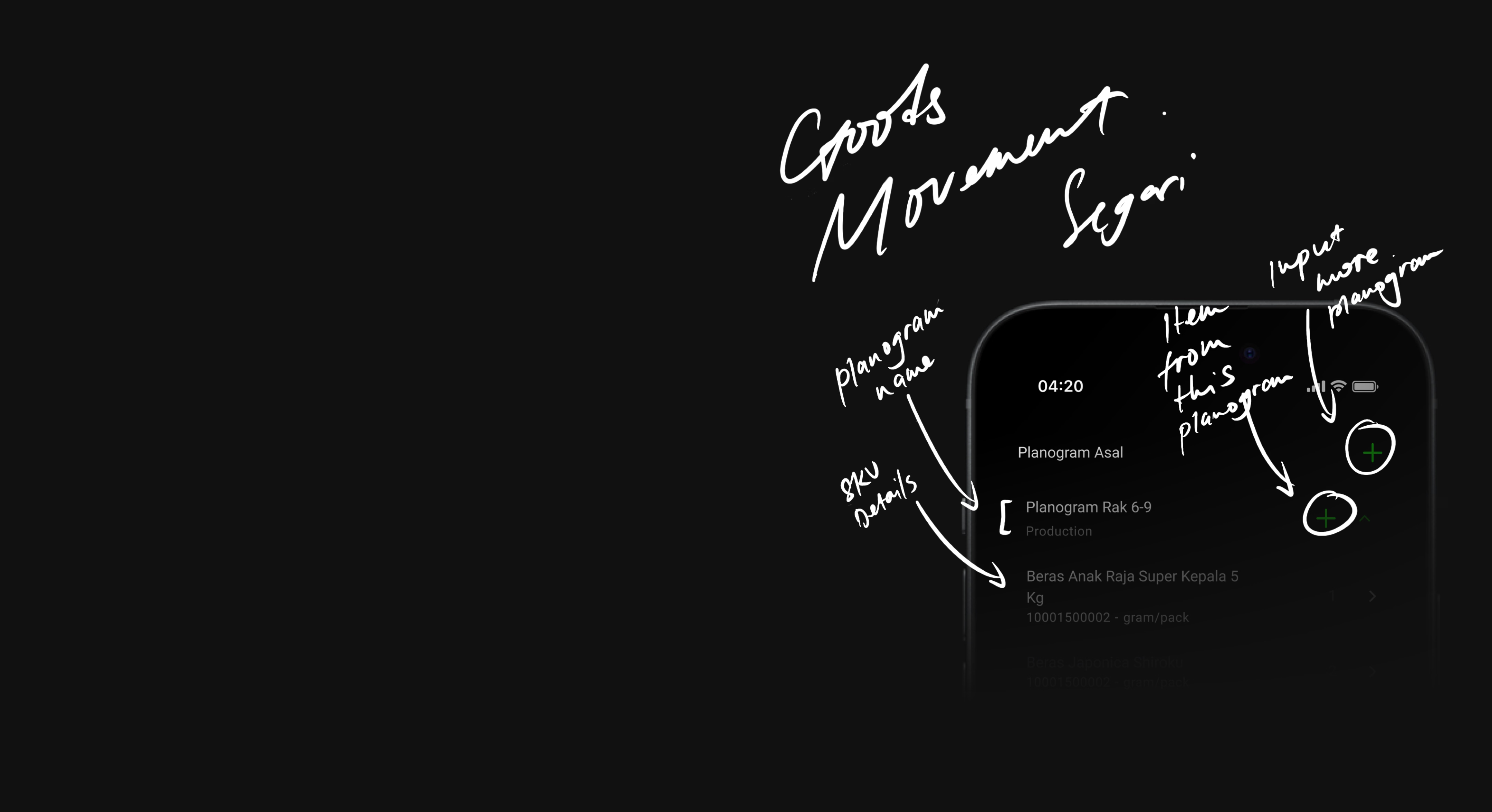
The showcase above represents my idea for context clarity, specifically on the sub-level of the flow (designating the goods out from a specific location):
• What I'm currently doing?
• Where am I located?
• What goods to grab?
• How many do I need?
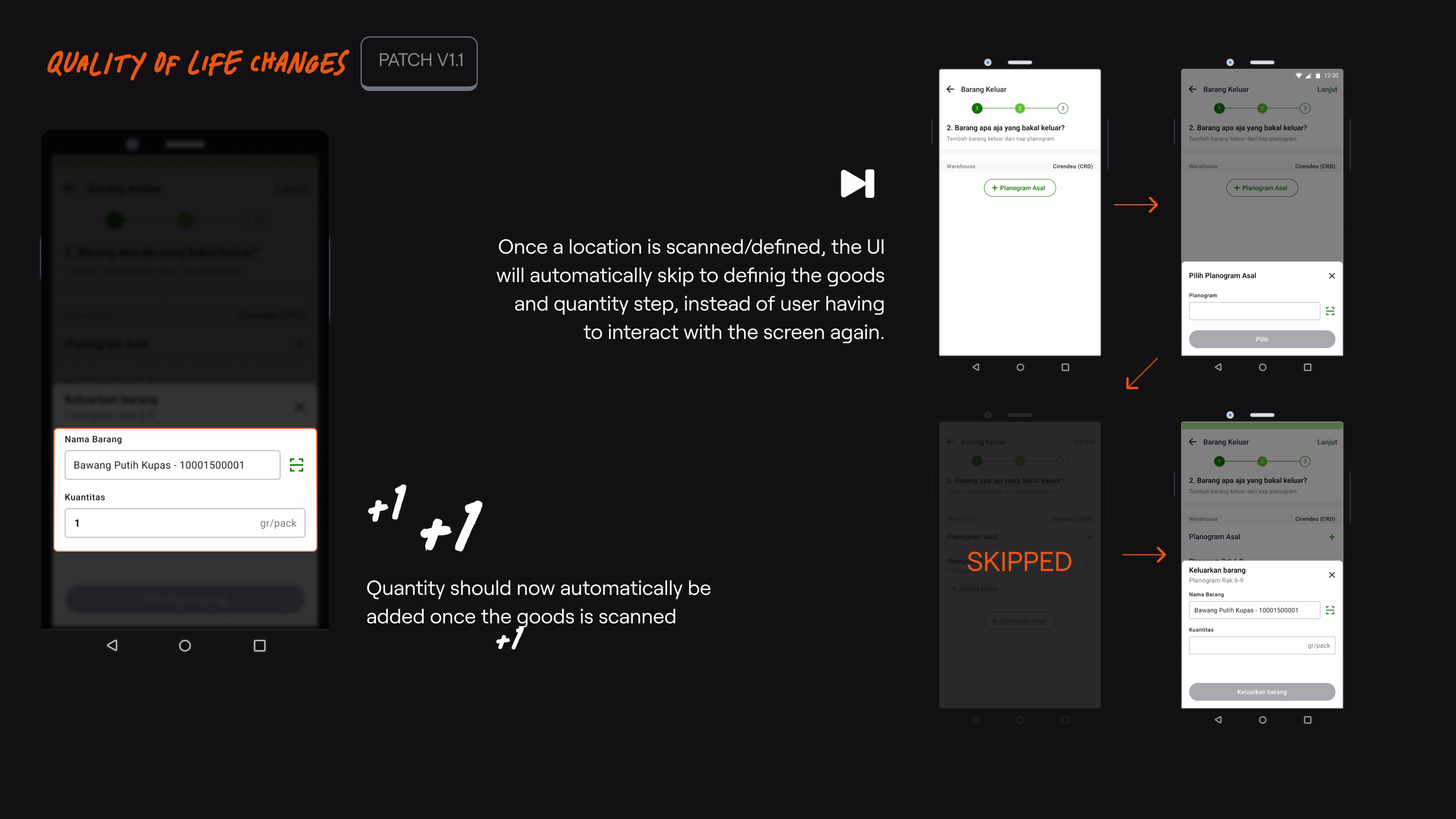
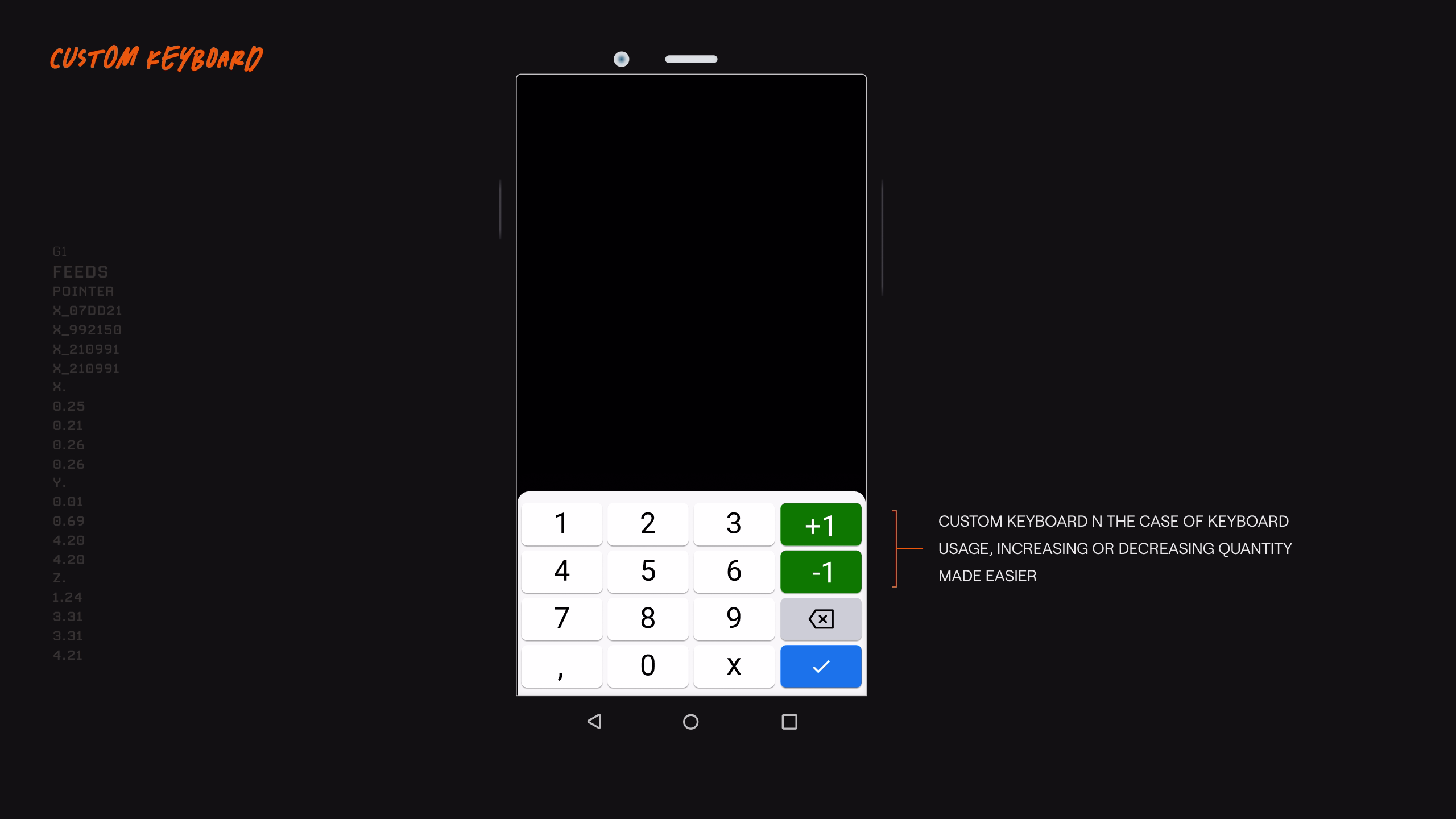
✦ TESTING, MORE INSIGHTS, & QOL CHANGES
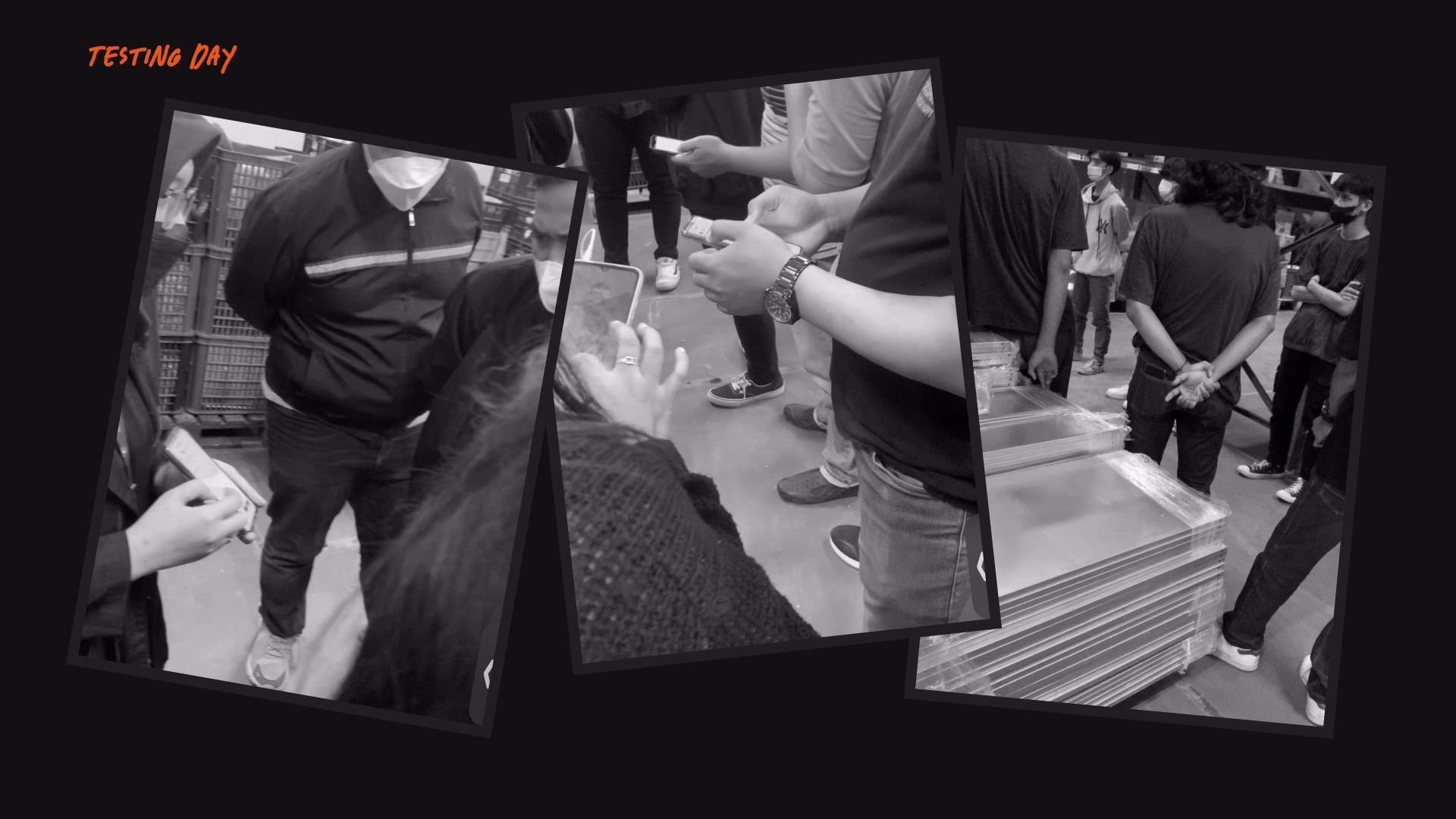
On the first ever test day, we did a quick introduction presenting the main flow. The product team didnt over-explain, and to let the participant ask instead, this was to validate if the app being self-explanatory. There were questions raised but it wast mostly technical questions regarding extreme edge-cases, but the main flow was perceived as easy breezy. The test was then conducted on a few selected domains for 1-2 weeks. Once the test was completed, we made improvements based on the feedback, which mostly were quality of life improvements.
LOADING CONTENT...
IMAGE
Testing day
Loading Content...
VIDEO
QOL IMPROVEMENTS
LOADING CONTENT...
IMAGE
Quality of life improvements
Loading Content...
VIDEO
Hide sticky components when scrolling down - Show when scrolling up
LOADING CONTENT...
IMAGE
Quality of life improvements
✦ RESULTS!
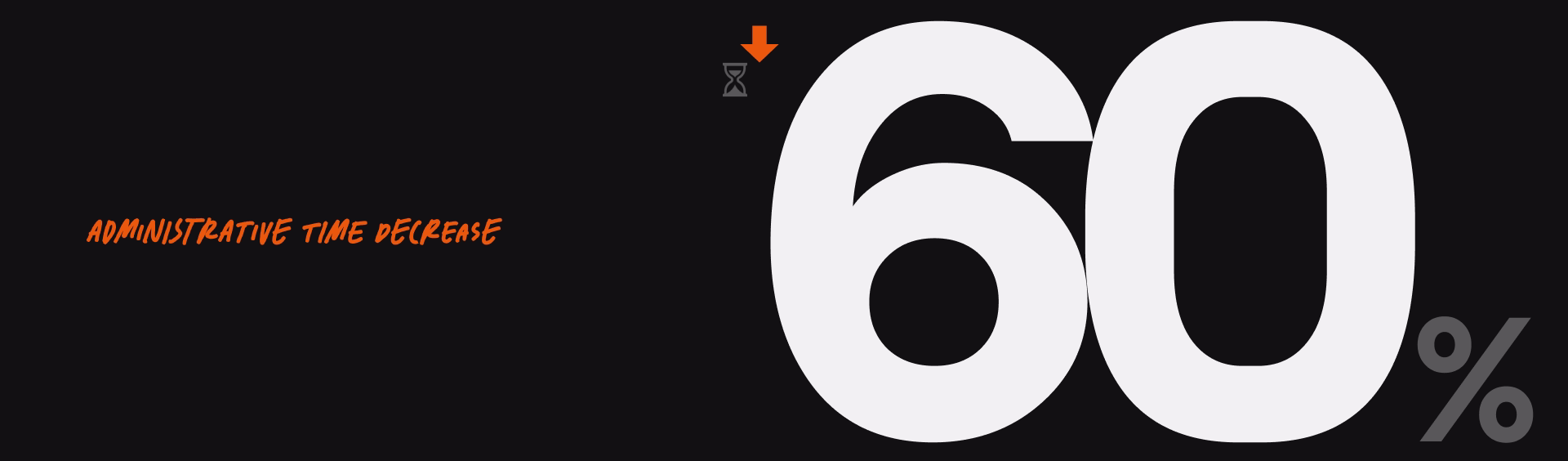
The general administrative task was slashed from an average of 2.5 minutes down to 1 minute a ~60% reduction. For the non-administrative task, the app workflow proved to have almost no negative impact (ie pushing the containers, moving the goods, etc), compared to prior of the app release.
LOADING CONTENT...
IMAGE
SPEEEEED
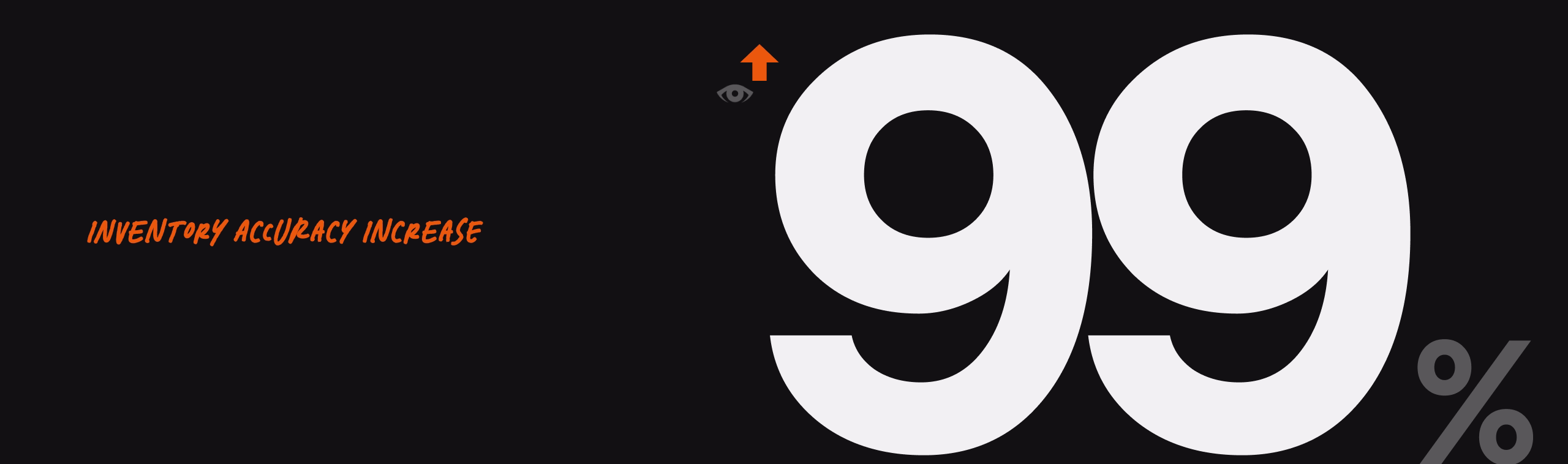
The inventory accuracy was increasing from less than 50% to a whopping 99%. Although this result was also the result combined with the newly released stock opnam tools at the time.
LOADING CONTENT...
IMAGE
accuracy
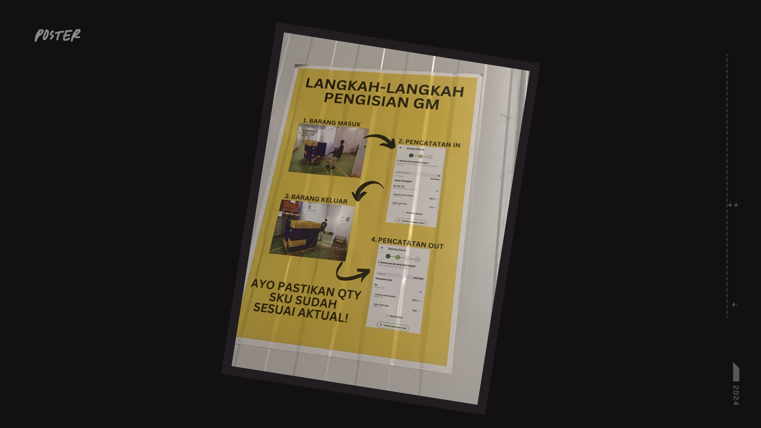
Until today, the project is still being used, continuously maintained, and has been adopted by the whole warehouse domains in the company.
LOADING CONTENT...
IMAGE
poster!
✦ WISDOMS & LEARNINGS
The whole project experience, to me, was slightly different compared to the usual customer-facing app. With project like this, I was able to directly observe the user behavior and get feedback directly with much less bias. I just went around the warehouse and started observing, as most of the workers didnt know who I was, there was no pressure on them to perform the task "nicely" as a usual test session would, especially when time was at stake for them.
Interestingly, there was a first-time moment for me: at a certain point of time after the release, a very specific edge case was overlooked by the team. Paralel when fixes were on its way, surprisingly, the workers found a 'hacky' way to work around it. As the person who did the design, I was surprised about a loophole in my own work that even I was not aware of. Maybe the feeling was similar to that of a game designer with the gaming 'speedrun' community -- basically a community where the players compete to complete the game as fast as possible with any means necessary (without third-party software). This meant forcibly finding loopholes and exploits within the game design itself even after it is considered ready-to-release
The key difference is probably that between the worker and the gaming community, the former does it because of an obligation, while the latter does it for love and pleasure of the game. Nonetheless, from a designer perspective, it was a great experience.
Beyond the technical aspect, human interaction/empathy being the best principle for collaboration was a no-brainer. Having a good & honest relation with the team, even the workers, made the project a lot easier. It wasnt always easy, but its generally healthy.
Back & forth discussion was never treated as hostility. Also easier getting honest feedbacks. Empathy goes a whole lot deeper than just a jargon, framework, or a tool. With the correct knowledge & approach, it shapes a person's honesty, humility, & confidence.